Instagram Changes Its Wordmark — and the Internet Is Asking: Can Gen Z Read Cursive?
By Thasmiya
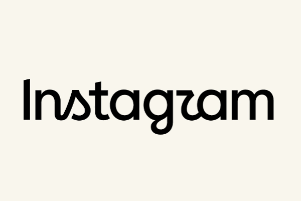
Instagram has refreshed one of the most recognisable parts of its identity, unveiling a **new wordmark for the first time in around a decade**.
The familiar handwritten “Instagram” lettering has been replaced by a cleaner design that mixes conventional letterforms with distinctive cursive-style characters. Instagram says the change is intended to make the brand feel sharper and more modern while retaining some of the personality of its original script.
But almost immediately, the internet found something else to talk about: **What exactly does the new wordmark say?**
Some users think the unusual “r” makes Instagram look more like “Instagzam”, while the debate has also revived an increasingly common question about younger internet users: **Can Gen Z actually read cursive?** ([The Verge](https://www.theverge.com/tech/979583/this-is-instagrams-new-logo?utm_source=chatgpt.com))
## **What exactly did Instagram change?**
The change is primarily to Instagram’s **wordmark** — the stylised written version of the company’s name.
Importantly, this does not mean the familiar Instagram app icon has disappeared. Reports on the redesign say the colourful gradient camera icon remains unchanged. ([The Economic Times](https://m.economictimes.com/tech/technology/instagram-introduces-new-wordmark-after-a-decade-logo-to-be-unchanged/articleshow/133220673.cms?utm_source=chatgpt.com))
Instead, Instagram has redesigned the lettering used when its full name appears.
The previous wordmark had a flowing handwritten appearance. The replacement mixes cleaner printed forms with selected script-like characters, creating something between traditional cursive and modern typography.
It is a relatively small branding change, but for a platform used by billions of people, even changing a single letter can become a major online conversation.
## **Why did Instagram change it?**
Instagram head Adam Mosseri described the new treatment as more modern while still maintaining a connection to the previous identity.
The wider brand refresh also includes updates to Instagram’s typography system. Reports say Instagram has updated Instagram Sans while introducing additional type families including **Instagram Pen**, which leans into handwritten expression, and Instagram Mono. ([UOL](https://www.uol.com.br/tilt/noticias/redacao/2026/08/13/instagram-vai-passar-por-mudanca-de-marca-apos-dez-anos.ghtm?utm_source=chatgpt.com))
The idea appears to be less about completely reinventing Instagram and more about giving the platform a visual system that can work across its increasingly broad range of products and content.
## **The internet immediately noticed the “r”**
Of all the letters in the redesigned wordmark, one has attracted considerably more attention than the others: the **“r.”**
Its unusual handwritten form has led some viewers to interpret the wordmark differently.
One joke quickly spreading through design discussions is that the new logo appears to read:
**“Instagzam.”**
Others have read variations such as “Instagwam”.
The criticism is not necessarily that cursive itself is difficult to read. Instead, some designers and users argue that combining printed and cursive-style letters within the same word makes individual characters harder to interpret. ([The Verge](https://www.theverge.com/tech/979583/this-is-instagrams-new-logo?utm_source=chatgpt.com))
Online reaction has not been universally negative, however. Some users like the cleaner appearance and argue that the new wordmark keeps enough of Instagram’s handwritten personality without looking as dated as the previous version.
## **And then came the Gen Z question**
The redesign quickly became connected to a much bigger cultural debate.
Social media users began joking that younger generations might struggle with the wordmark because **Gen Z cannot read cursive**.
That claim needs some context.
Gen Z is not a single educational group, and whether someone learned cursive varies enormously depending on their country, school system and age.
Many older Gen Z adults were taught handwriting and cursive at school. Others grew up as classrooms increasingly shifted towards laptops, tablets and digital assignments.
So saying “Gen Z can’t read cursive” is far too broad.
But there is a real generational shift behind the joke.
## **Why are fewer young people using cursive?**
Writing habits have changed dramatically over the past two decades.
Students increasingly complete assignments on:
- Laptops - Tablets - Smartphones - Chromebooks - Online learning platforms
Meanwhile, everyday communication has moved towards messaging apps, social media, email and digital documents.
As typing became more important, some education systems reduced the amount of classroom time dedicated specifically to cursive handwriting.
That means younger people may encounter traditional cursive less frequently than previous generations did.
Reading cursive and writing it fluently are also different skills. Someone may easily recognise cursive lettering without being comfortable producing an entire handwritten page themselves.
## **But Instagram’s new logo isn’t really traditional cursive**
This is where the online argument gets more interesting.
Instagram’s redesigned wordmark is not simply a sentence written in conventional cursive.
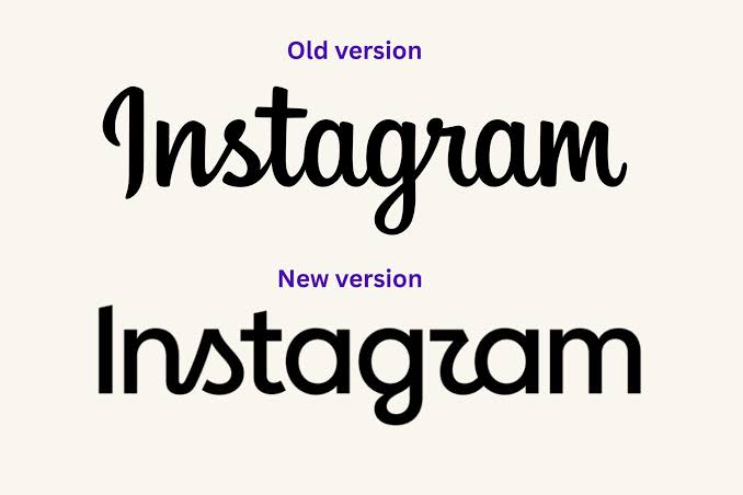
It deliberately mixes styles.
Some letters appear relatively straightforward and printed, while others contain exaggerated handwritten strokes.
That stylistic combination may explain why even people perfectly capable of reading cursive have questioned particular characters.
In other words, the debate may say as much about **graphic design and legibility** as it does about Gen Z.
## **Why would Instagram choose handwriting at all?**
For a social platform, handwriting carries useful associations.
It can feel:
- Personal - Creative - Individual - Human - Expressive - Informal
Those qualities fit Instagram’s positioning as a place where individuals share photographs, videos, art, fashion, personal moments and creative work.
A completely neutral corporate typeface might be easier to read, but it could also make Instagram look like almost every other technology company.
The handwritten details give the wordmark personality.
Instagram’s wider typography refresh reportedly follows the same idea, with its new Pen family specifically introducing a more handwritten quality into the brand system. ([UOL](https://www.uol.com.br/tilt/noticias/redacao/2026/08/13/instagram-vai-passar-por-mudanca-de-marca-apos-dez-anos.ghtm?utm_source=chatgpt.com))
## **Instagram has survived logo controversy before**
This is certainly not the first time an Instagram redesign has upset the internet.
In **2016**, Instagram replaced its famous retro camera icon with the simplified pink, purple and orange gradient icon users recognise today.
The reaction at the time was intense.
Many users criticised the simplified design and wanted the old camera back. A decade later, the gradient icon has become one of the most recognisable app symbols in the world. ([Creative Bloq](https://www.creativebloq.com/design/branding/rebrand-revisited-instagrams-controversial-2016-redesign?utm_source=chatgpt.com))
That history is worth remembering when judging the new wordmark.
Brand redesigns often feel strange simply because millions of people have spent years looking at the previous version.
## **So can Gen Z actually read cursive?**
The better answer is: **some can, some can’t — just like almost every generation.**
There is evidence of a broader move away from extensive handwriting as digital devices have become central to education and communication, but Gen Z covers millions of people educated across completely different systems.
And Instagram’s wordmark is not a particularly fair cursive-reading test anyway.
Its lettering intentionally combines multiple typographic styles, meaning the confusion surrounding the “r” could simply be a consequence of the design itself.
In fact, online design discussions include people simultaneously arguing that the new letter is obviously an “r” and others insisting it resembles a “z”. ([Reddit](https://www.reddit.com/r/Design/comments/1vnbtdo/instagram_changes_its_wordmark/?utm_source=chatgpt.com))
That might be less of a generational literacy problem and more of a typography problem.
## **Why changing a famous wordmark is risky**
Instagram has an advantage most brands would love to have: people can recognise it almost instantly.
That also makes redesigning it difficult.
A new brand identity needs to accomplish two conflicting things.
It must feel different enough to justify changing, while remaining familiar enough that users recognise it immediately.
Change too little and people ask why the redesign was necessary.
Change too much and the brand loses years of accumulated recognition.
Instagram appears to have chosen the middle ground — preserving handwritten characteristics while simplifying the overall wordmark.
The debate over whether that compromise actually works is likely to continue.
## **The internet’s reaction may actually be good for Instagram**
From a branding perspective, widespread disagreement is not necessarily a disaster.
People are:
- Comparing the old and new designs - Posting screenshots - Discussing individual letters - Sharing memes - Debating cursive handwriting - Talking about Instagram’s brand
A relatively small typography update has therefore generated a surprisingly large amount of organic attention.
Even “Instagzam” jokes keep the redesign circulating.
The biggest problem would be if people stopped recognising the brand entirely — and given Instagram’s enormous existing recognition, that seems unlikely.
## **Why this matters**
Instagram’s new wordmark is a small visual change that has unexpectedly opened a much bigger conversation about design, technology and how younger generations communicate.
The debate over whether Gen Z can read cursive is entertaining, but it oversimplifies what is actually happening.
Handwriting has undoubtedly become less central to everyday communication as phones and computers have taken over. But Instagram’s new wordmark is also deliberately unconventional, mixing print and script in ways that can make particular letters ambiguous.
So if you looked at the new Instagram wordmark and briefly wondered whether it said “Instagzam”, don’t panic.
It might not be your cursive.
It might just be the **r**.
## **FAQs**
### **Did Instagram change its logo?**
Instagram has changed its **wordmark**, the written “Instagram” branding. Reports indicate that the familiar gradient camera app icon remains unchanged. ([The Economic Times](https://m.economictimes.com/tech/technology/instagram-introduces-new-wordmark-after-a-decade-logo-to-be-unchanged/articleshow/133220673.cms?utm_source=chatgpt.com))
### **When was Instagram’s previous major redesign?**
Instagram’s famous gradient camera redesign arrived in 2016, replacing its retro camera-style icon. ([Creative Bloq](https://www.creativebloq.com/design/branding/rebrand-revisited-instagrams-controversial-2016-redesign?utm_source=chatgpt.com))
### **Why are people calling the new logo “Instagzam”?**
Some users say the stylised “r” in the new wordmark resembles another letter when combined with the surrounding typography, leading to the “Instagzam” joke. ([The Verge](https://www.theverge.com/tech/979583/this-is-instagrams-new-logo?utm_source=chatgpt.com))
### **Is the new Instagram wordmark fully cursive?**
No. It mixes more conventional printed letterforms with handwritten or cursive-style elements.
### **Can Gen Z read cursive?**
There is no accurate basis for saying an entire generation cannot read cursive. Cursive education varies by country, school, age and curriculum, while reading cursive is different from being able to write it fluently.
### **Why does Instagram still use handwritten elements?**
Handwritten typography can communicate personality, creativity and individual expression — qualities that align closely with Instagram’s identity as a visual and creative social platform.
### **Is Instagram changing its app icon too?**
Current reporting on the refresh says the familiar gradient camera icon remains unchanged, with the update focused on the wordmark and broader typography system. ([The Economic Times](https://m.economictimes.com/tech/technology/instagram-introduces-new-wordmark-after-a-decade-logo-to-be-unchanged/articleshow/133220673.cms?utm_source=chatgpt.com))
## **Source Credits**
Information source and resource owners: Instagram, Meta, Adam Mosseri, The Verge, Economic Times and cited design and technology reports.
Image sources are combined from AI-generated visuals and other platforms. If any owner wants to be mentioned or any content needs to be changed, please email us at **concerns@whatmatters.ae**.